


How To Make A Good Powerpoint Presentation Design
Presentation design: The art and science of putting together a presentation that can captivate an audience, inform them on a topic, and inspire them to action.
If you can give your audience what they want in an engaging and unforgettable way, you’ll have a knockout presentation.
So how do you keep your audience listening with riveted attention and effectively deliver your message?
That is what this guide is all about.
We will be going over the elements and components of presentation design so you can follow along and ace your presentations.

Here at Moxie, presentation design is one of our core areas of expertise. Whether it is PowerPoint or other media platforms, we know what it takes to deliver a great presentation.
We are going to break down the process for you and if you follow the guide, you are going to impress and captivate your audience. Your message will be clear and your presentation will look like a million dollars!
Elements of Presentation Design
Think of creating a presentation like baking a cake or fixing up a car. When you break down the process into its individual steps it's never as complex as it first seems.
So whether you want a presentation design as delicious for the eyes as a three-tier red velvet wedding cake or as elegant as a Ferrari, we'll teach you the fundamentals needed to bring your vision to life!
We’ll cover the following elements below:
- Purpose - This is your “north star”, it’s what guides your entire presentation
- Audience - Understanding your audience will help you define the style and tone of your presentation. Super important if you want to connect with them
- Theme - The theme of your presentation is a memory aid to guide you and help you remain consistent in your message. (This is different than the PowerPoint theme we will be reviewing later)
- Content - This is “the meat and potatoes” of your presentation. It’s what your audience will need to process to get what they came for
- Design - This is where the magic happens! This is where you take everything you are going to learn in this guide to persuade them to your point of view. You have to nail this part, and we are going to help you do just that
Now, let’s explore each of these visual storytelling elements in detail to help you prepare a knockout presentation.
Purpose - Keeping You And Your Audience Focused
The purpose of your presentation must be clear and compelling to your audience from the very beginning.
A great way to start formulating the purpose is to “begin with the end in mind”. Said another way:
What is the one goal you want your audience to achieve? Remember, it’s all about them.
Hone in on their “Why”:
- Why are they attending your presentation?
- Why is this important to them?
- What will they get out of it when it’s done?
Once you have some ideas, use this as a practical guide for writing a clear and compelling purpose statement:
- Use specific and clear language
- Distill your ideas into one full sentence
- The purpose should be phrased as a statement, not a question
For example, let’s say you are looking to persuade a company or team to incorporate the Agile Method as the ideal framework for project management. Below is one correct way to write your central purpose, and one incorrect way of doing it.
Good Statement of purpose
“Agile, is an iterative approach to project management that helps teams improve collaboration for more efficient and successful projects.”
Weak Statement of purpose
Agile does a lot of really helpful and useful things to help teams be much better. Adopting the Agile methodology ensures operational efficiency improvements through streamlined project task management. It can reduce the time to complete tasks by 20%. Agile can also eliminate the redundancy of tasks.
Now let’s look at a presentation to persuade the audience to change their view of life insurance and consider using it as a financial planning tool:
Good Statement of purpose
“Life insurance, if properly used, can provide financial security during your life, help you eliminate estate taxes, and give your family peace of mind when they will need it the most.”
Weak Statement of purpose
“Life insurance comes in various forms. Depending on your specific circumstances, you can choose a term policy, whole life or other more adequate policy types to suit your needs.”
Don’t get hung up on coming up with this gem before you start your research. You are more likely to formulate this one statement after you have researched your topic and developed your main points.
Keep in mind that your audience is there for themselves. Your purpose should connect with them in a way that they know you’ve given them valuable insights tailored just for them.
And speaking of tailoring insights just for your audience:
Audience - The Focal Point Of Your Presentation
One of the most important steps in preparing for your presentation is conducting audience analysis. Do some research and find out their interests, likes and dislikes, and pain points.
You need to connect with them at a deep level if you are to move them with your presentation. And knowing what’s going through their mind will give you a definitive edge in forming that connection.
How much do they know about the subject? You need to approach them differently if they are hearing about your topic for the first time, or if they are already familiar with it.
We have all been at a presentation where the leader is going on and on about something that’s been covered before or is common knowledge.
An example of this is the healthcare industry which has to be very careful about what they say and how they say it to avoid controversy. Studies have proven that audience analysis is key to creating targeted messages, with mass appeal, that encourage the behaviors they want.
Let’s take a look at some of the questions you may need to ask yourself about your audience before you start building out your presentation:
What are the audience demographics?
You must align your message to your market. C-level executives and warehouse workers speak a very different language, have different priorities they care about, and are looking for very different solutions and ideas. Craft your message to “meet them where they are”. Your content and design need to relate to them.
Why are they attending your presentation?
It’s important to know this to understand your audience’s state of mind and expectations.
For instance, are they attending a company-required presentation that may have little impact on them? Their attention span may be short and you will need to prepare accordingly by making them care about what you have to say from the very start.
Maybe your audience is attending to learn more about a new product offering. Even if it is something of keen interest, you will only have their full attention if you find out why they are excited to learn about the new product.
E.g. It’s no good talking about how fast a new car goes if the audience only cares about its safety features.
What do they expect to get out of it?
If the audience is attending to learn a new skill/concept to improve their life or career, your presentation will have to involve a specific type of content.
For example, someone hired to provide skills-based training will have to significantly alter their presentation depending on the context. In one case, they may be training a team to improve their productivity at work. In another, they may be teaching the same skills but to employees that are being laid off due to cuts.
Imagine how bad the presentation would go if the trainer didn’t do their due diligence beforehand! Knowing what your audience wants from the presentation will ensure you give them exactly what they need.
Theme - The Big Idea
The theme of your presentation is much like the theme of a story. It sets the tone and tempo. It’s the focal point and foundational idea that, in the end, you want your audience to connect with.
Let’s take an insurance sales presentation for example. The main point you want to get across is the peace of mind the buyer would have when they purchase a life insurance policy. So “peace of mind” would be your theme.
It would be supported by examples and stories where insurance has made a significant difference in someone’s life and helped them feel supported and reassured.
Another example in this same subject could be that people are unaware of the hidden financial benefits of life insurance. In this case, the theme would be “expert financial secrets”—see how this completely changes the tone, tempo, and direction of the presentation?
Instead of peace of mind, they learn that life insurance is a hidden vehicle for financial prosperity that hardly anyone is aware of. Those that know about it, are reaping the rewards.
Your presentation needs to be designed to support the theme with cohesive elements such as the right images and information. We cover this further down!
A great way to make sure the theme of your presentation is memorable is through the use of stories. Stories connect with people. There is a reason people stay in a movie theater or in front of their TV for hours—they become immersed in the stories.
Every business that uses stories has a competitive advantage. Ultimately, they are memorable, and interesting, and make any topic/brand/idea far more engaging. Use this principle to your advantage when you come up with your theme and when deciding what content to include in your presentation.
The theme is your framework, but the content, design, and visual storytelling are what bring it to life.
Content - What You Will Deliver
This is where you will decide the information you are presenting and how you will showcase it.
You will pick the images and text, and if appropriate, video that will make up the content of your presentation.
The first thing we are going to look at is the type of presentation you are going to deliver. Let’s dive a bit deeper into the three most common business presentation types.
1. Presentations To Inform
From knowledge transfer and sharing ideas, to product launches and new initiatives—these presentations are all about providing information in an exciting and memorable way.
For example, you may be informing a group of employees about a new product or service by their company and their role in it.
Your content here would include images, features, and benefits of the product or service—anything that helps them understand the value and how to promote it to customers.
Another example would be a board meeting to discuss a new acquisition of assets by the company. The goal would be to cover the pros and cons so that the board members can make an informed vote on whether to proceed or not.
The content of this presentation would be mostly facts and data-driven. Our data visualization section below teaches you how to turn boring charts and graphs into interesting visuals that tell a story. The goal is to help them see the vision if the acquisition is made. Paint the picture for them.
2. Presentations To Inspire
The goal of this type of presentation is to inspire the audience. To give them a new perspective on prior knowledge or opinions and drive them to action.
For example, a fitness expert may want to inspire people to do more exercise. They did their research and learned that their audience is mostly inactive and believes all exercise is hard work and uncomfortable.
To inspire them, they find research and stories of people who significantly improved their health just by having fun going for peaceful walks or dancing to their favorite songs at home. They show that exercise isn’t painful 5am gym classes, it can be enjoyable and relaxing!
The content for these presentations will be emotional messaging and imagery. Stories crafted to captivate the audience and make them feel the importance of what you are saying.
3. Presentations To Persuade
This is the type of presentation we are more accustomed to, whether in the audience or at the front of the room. The purpose is usually to make some type of sale, to persuade somebody to do something.
The goal may be to have the audience buy a product or service. It could be to convince the audience to form a partnership or association with you or your company. In some cases, these could be job interviews as well. Someone has to be persuaded to take an action.
For example, imagine a job interview that requires you to give a presentation on why the company should hire you. A good presenter won’t just talk about themselves, they will have done research to identify problems within the company and the solutions and improvements they can implement if they are hired.
The content here will be a mix of facts and data to support a vision of how the product or service will benefit the buyer.
Pay very close attention to which of the three types of presentations above you need to prepare for. Your content needs to align with the type and purpose of the presentation.
Pick A Relevant Topic And Make It Interesting
Your topic of course needs to keep the audience’s attention. Granted sometimes you may not have much of a choice in the topic. You CAN, however, be creative in making the topic interesting and relatable to them.
Are you talking about the new HR Software being released by your company? Don’t focus on the features. Few people can connect with the “Employee Time Clock” or “Task Management System” features integrated into the software.
Talk about how they will no longer have to manually print out checklists and fill in work orders by hand. How they will no longer, “gasp!”, sign off on manual timesheets and fax them to payroll for processing!
Make it all about them:
- What does the product or service do for them?
- How will their lives be better because of the product or service?
This is by far more interesting than going on and on about the specs and features.
Craft Your Core Message
You are going to start here by doing a little brainstorming. OK, maybe a lot of brainstorming!
Ask yourself: What is the ONE thing my audience needs to know?
Yes, you need to focus on ONE core message. It is not uncommon for presenters to be tempted to talk about 2 or 3 maybe even more important, key elements. This dilutes the primary focus and confuses the audience.
Write down as many ideas as you need to so you can draw out the essence of your presentation.
When you have a simple and easy-to-understand answer, you will have the core message to present to support your main point.
Understand What Makes Your Audience Tick
To help you put an exceptional presentation together, it’s crucial to go over some established principles of human behavior. You will use these to help you connect with your audience and draw them into your message.
Make no mistake about it, ignoring this can cost you.
Consider this; You go before an audience of 100 people, all possible buyers of your product/service. If understanding how those buyers process your presentation can improve your conversion rate by 10%, how much extra revenue will that bring in to your business?
Here we go, understanding these two things is a game-changer;
- How Our Brain Processes Information
- The three learning modalities
These concepts are often overlooked when designing a presentation, and you will see soon why they are so important.
How Our Brain Processes Information
We have multiple types or stages of memory through which we process information—and understanding this is key to designing a presentation that your audience remembers long after.
Sensory Memory
Sensory memory is, obviously, triggered by the senses and holds information for brief periods of time.
The senses of sight and hearing are your most important elements in presentation design. During your presentation, the visuals you show must be captivating and interesting to look at. And the story you tell needs to be delivered with vocal variety and intrigue.
Short-Term Memory
Ok, this one requires no explanation. And since you’ll be designing an eye-catching and unforgettable presentation, you won’t even have to worry about it.
Working Memory
Consider working memory similar to your computer’s RAM. It is information that can be used for the execution of tasks in the here and now. It is readily accessible and lasts for a minute or less.
An example of this is when someone gives you a phone number and you try to remember it while you write it down or dial it on your phone. If it takes you five minutes to get to it, you will no longer remember it.
When designing your presentation, engage your audience by including sections where you ask questions that follow small, bite-sized pieces of information you’ve shared. When an audience feels like they’re following along, they feel like they’re learning and getting value from you.
Long-Term Memory
This is the storage of past events and information we have gathered throughout our lives. According to extensive research on the matter, including a publication by the National Library of Medicine, long-term memory comes in two forms: explicit memory and implicit memory.
- Explicit memory is consciously accessed such as childhood memories or facts we know. The goal of your presentation is to be so memorable that others talk about it long afterward.
- Implicit memory affects us subconsciously and influences our behavior. Whether your presentation is about a social issue or simply a new product, you want it to leave such an emotional impact on your audience that they make new choices based on what they learned from you.
In short, you want to create a presentation that ignites your audience’s senses, challenges them to think, and is interesting enough to create a lasting impression.
With that goal in mind, it’s important to understand how your audience learns.
The Three Learning Modalities
There are many ways to your audience’s hearts and minds—but we’re going to focus on the top three. The primary learning styles are:
- Visual
- Auditory
- Kinesthetic
Within your audience, you will find a mix of learning styles so try to plan and deliver your presentation to cater to them all if possible.
Visual (65% of your audience will fall in this category)
You need big, bold, eye-catching presentation slides. We cover how to make them below but it’s important to state here that interesting images and well-designed graphics will guarantee better attention and retention from the majority of your audience.
Auditory (30% of your audience will fall in this category)
This is where your verbal communication and abilities as a public speaker really count. Your words need to be clear and precise but also spoken with intrigue and passion. Auditory learners value engagement so they will welcome questions for discussion.
Kinesthetic/Tactile (5% of your audience will fall in this category)
This is the hands-on group. They are a little more difficult to connect with in a presentation as they prefer to be immersed in the learning process.
But by making use of props and physical activities to illustrate your points, you’ll not only appeal to these learners, but the rest of the audience will likely enjoy the novel experience (which helps with long term-memory)! .
Thankfully, if that isn’t an option for you, they are a small percentage of the population and even they will benefit from the visual and auditory elements of your presentation.
You are now equipped with some essential and practical insights to help you connect with your audience. You understand how they will process the information you present and how to appeal to the three dominant learning modalities.
These are the most effective ways to get your message into your audience’s mind!
So let's put this information into the next step of preparing the content for your presentation. We’ll cover the essential methods of structure and organizing to give your deck a logical flow that makes the biggest impact.
Structuring Your Presentation Like A Pro
It’s amazing how a skilled presentation designer can take the same “Intro, Body, Conclusion” structure everyone else uses—and do it so much better.
Naturally, we’re going to teach you the tips and techniques used by our own presentation experts so you can create a deck that stands out.
The Intro
Opening your presentation is where you set the tone and clearly articulate the core message of your presentation.
The number one goal of your openings is to persuade the audience to give you their most precious resources—their time and attention.
But good news! They all secretly want you to wow them and succeed!
We can all learn from great presenters such as the late Steve Jobs. The openings to his keynotes were, well, epic! Opening statements such as “Today, we are going to change the way the world views a phone” clearly let the audience know what is before them.
How you open the presentation may be a matter of taste and your comfort level with different tactics. A story, a tasteful joke, a poem, or a great quote, can all be good ways to open.
It is also during your opening that you can begin to engage your audience. Audience engagement can be subtle or overt. You can pose questions or make statements that will drive them to think hard about what you said. You can also get them more directly involved by asking questions to audience members, taking polls, etc.
As you can see, there are several different ways to open your talk and capture the attention of your audience from the get-go.
The choice is yours, but at Moxie, we suggest you go for a strong P.U.N.C.H.
The Body
This seems obvious but many presenters get this wrong—your main topic and supporting points need to be arranged in a logical order. The flow must make sense and be easy to understand by the audience.
If you have the time, always ask a friend or colleague to review your presentation’s structure at the start before you invest a lot of time designing. What may seem logical to you may not make sense to others
Try using the “Rule of 3” in this section. The concept here is that ideas or stories presented in threes are more memorable to the listener. Each section or slide should be divided into three pieces of content or information.
The best way to nail down the structure and flow of your presentation is by storyboarding. You can simply get paper and pen and sketch out the storyboard—we happen to have a great resource you can use for that. Or you can also use a variety of storyboarding tools available online.
Here are our recommended four steps to creating your storyboard:
- Write down the major points of your presentation, one for each sticky note or frame of your storyboard.
- Draw a quick sketch for each topic to use as a visual clue for your presentation.
- Lay out your cards on the table or whiteboard and place them in the order you will be presenting them.
- Develop each point/topic and make and revise the order and sequence if it makes sense once you have it all done. Make sure it flows well in a storylike format.
The body of the presentation is where we may tend to get wordy, to ramble on. Don’t fall into that trap. Here at Moxie, we are strong believers in the idea that “Every word of your presentation should have to fight for its existence”. Your message should be clear.
Your time—and your audience’s time—isn’t unlimited. During the time you have together, you’ve got to make sure that each phrase supports your message, and delivers value.
And here’s our golden rule:
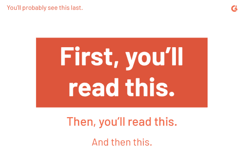
One Idea Per Slide
Want to talk about the seven benefits of your new product? One benefit per slide. Want to discuss the reasons for lower sales this quarter? One reason per slide.
People get scared because suddenly their 20-slide presentation suddenly goes over 50 slides. But what you have to remember is that the time you spend talking about each point doesn’t change.
What do you think is more interesting to an audience:
- One slide with seven bullet points on it that the presenter reads one by one? Where the audience has already read ahead and is focused on reading and not listening?
- Or seeing a single statement with a compelling visual and listening to the presenter expand on it before they move to a new slide and a new visual.
Hint: it’s the one where there’s more novelty to capture their attention.
Conclusion
This is your final opportunity to inspire the audience to take the action you want.
Here is how we do it at Moxie, and it works every time:
In keeping to the “Rule of 3” we just mentioned, the conclusion should:
- Summarize The Key Points
The trick here, is to frame each point in a way that perfectly builds towards, and justifies, your call to action. - Add One Final Surprise
Whether it’s a powerful visual, a startling statistic, an inspiring quote, or even a great joke that ties everything together, creating one final “Wow!” moment just before you end will leave a lasting impression. - End With A Call-To-Action
A great presentation is like a piece of music that builds to an emotionally-charged crescendo! By the time you get here your audience should be invested, interested, and inspired to do something.
Give their emotions a direction and a purpose! Give their minds clear steps to take. Standing ovations happen because audiences are so hyped on the energy of the presenter they feel compelled to stand and cheer.
And that feels like something worth aiming for right?
There is a strategy and process to end your speech or presentation with authority. We have put these ideas to the test countless times. Trust the process, you don’t have to reinvent the wheel.
Phew!! That was easy right?! Now that you have an in-depth understanding of the psychology and building blocks of a great presentation, it’s time to add the final polish that will make it exceptional.
Putting It All Together: PowerPoint Presentation Design
You may have seen some expertly-crafted presentations that included many of the tips above—that still looked like an absolute mess!
The reality is that your audience will judge your presentation based on how it looks. And studies show that good design has a great ROI and a significant impact on your success and reputation.
The good news is that we’ve covered everything you need to know below with a video to cover some additional concepts!
Choosing Your Presentation Theme
This is the skeleton of your design. The core elements that will affect how the rest of the slides look. Combining a stylish theme and visuals with a great story will really wow an audience so take the time to figure out what is right for you..
You want to select a theme that:
- Represents your brand image
- Uses your brand colors
- Be sure to use/upload graphics and any images that you use in your other marketing materials
- Sets the right tone for your topic
- E.g. Sleek and corporate, fun and creative, somber and serious, etc.
- Creates a cohesive look and message to give the audience a sense that you have your act together—and you do!
Even if you think you aren’t a good designer, more often than not you can trust your intuition. Put yourself in your audience’s shoes (or eyes) and just see which theme feels right.
How To Create Professional-Looking Slides
Visual Hierarchy
All great design starts with visual hierarchy. This means that you will arrange each element in a way that guides the viewer’s eye so they look at each piece of information in the right order of importance.
A quick example is the outline of your presentation. This is probably the visual hierarchy of your content:
For example, by simply using size, position, and color you can instantly tell what’s more important.
You can also use the size of images and color to emphasize the importance of different elements of the presentation.
Using contrast in colors as in the above images helps your audience focus on specific elements of your slides.
Slide Aspect Ratio - Landscape or Square?
Have you ever been in a presentation where the slides are square and the screen is landscape-oriented? Are you just as annoyed as we are about that ugly black space on both sides of that screen?
Not only is it “aesthetically challenged”, but that screen real estate can also be used for better purposes than annoying the audience!
Most presentations nowadays are made for screens with an aspect ratio of 16:9. Make sure your slide aspect ratio is the same. It’s that simple.
It is very easy to use a PowerPoint theme with the correct aspect ratio. Do not make the mistake of taking a square theme you have laying around and auto-resizing the layout to the wide format. Your graphics will be out of place which makes matters worst
Using Pictures and Graphics
Choosing the right image and the right size for your slides will have a direct impact on the effectiveness of your presentation. We have touched on the emotional effect that photos can have on people. By using high-impact visuals, you can cement your information into the mind of your audience.
Choose professional high-quality stock photography for the best results. The images should support your content and add to the aesthetic value of the slide.
Keep the images simple as much as possible, especially if you are overlaying text. Don’t overwhelm the audience or force them to pay more attention to the slide than to you.
Lastly, for the love of all that is proper! DO NOT use clip art unless you are making fun of it! Clipart is outdated and makes your presentation look amateurish and cheap! OK.. clearly that triggers us here at Moxie!. Just stay away from it!
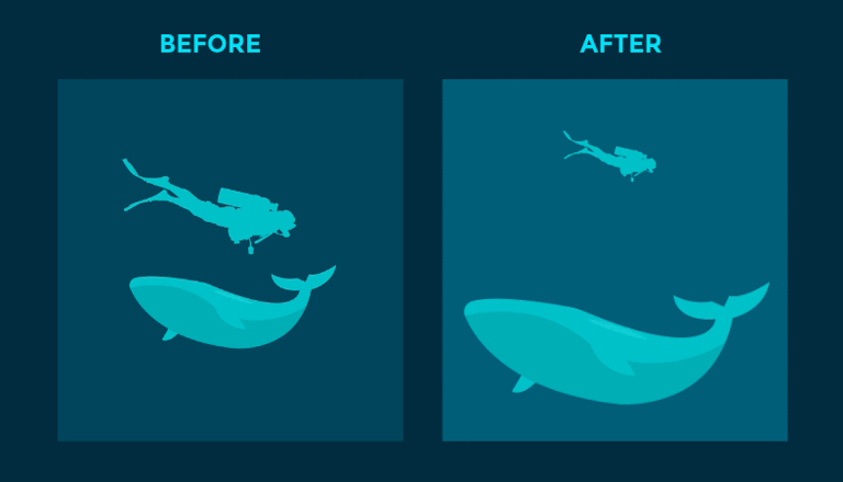
Create Depth
By creating an illusion of depth, you can make elements in your design “pop.” For example, you may blur the background and make one piece of information or text clear and distinct in the foreground.
Or as seen below, the resizing of the images creates a sense of scale.
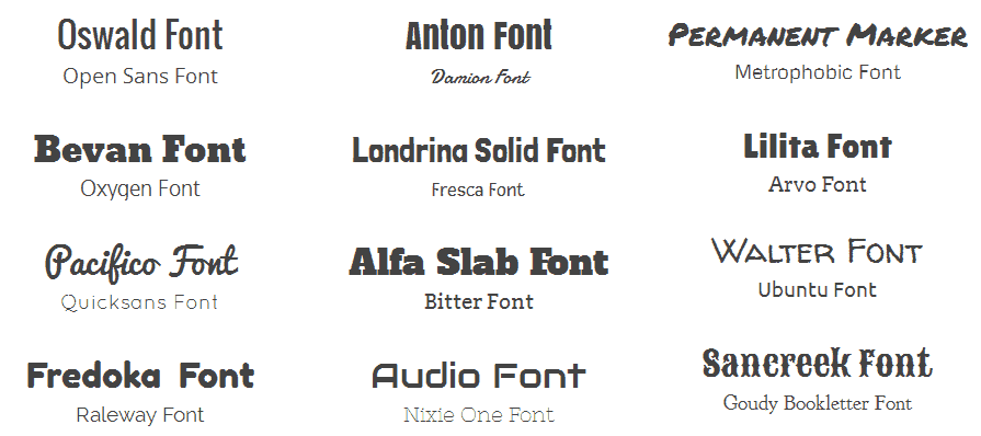
Choosing & Designing With Fonts
There is a tendency to overlook the importance of fonts in presentation design. Do not make that mistake. Using the proper font and size has a measurable impact on the quality of your presentation.
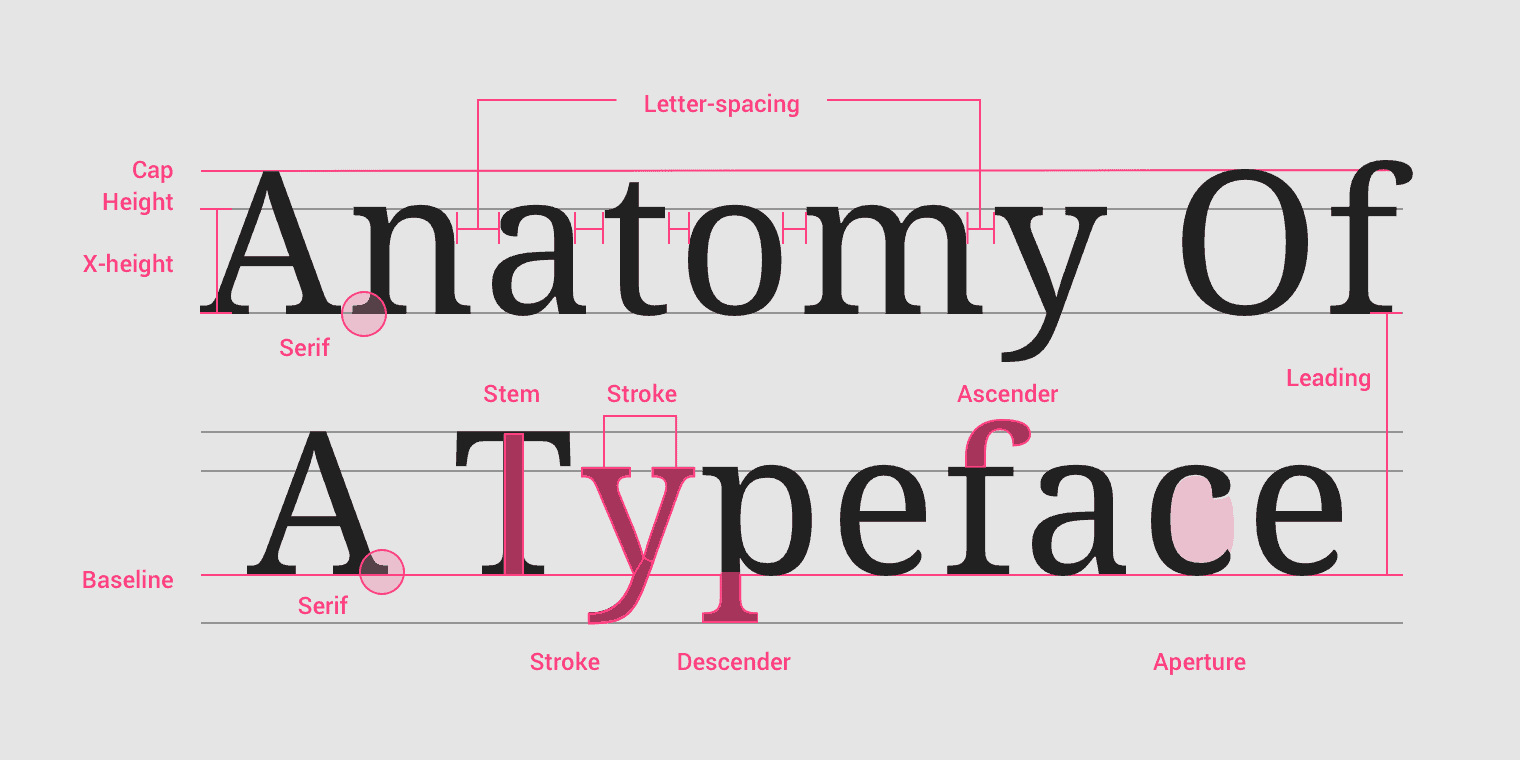
The right fonts will attract your audience’s attention. It will help your audience focus more on the message you are trying to convey.
It creates harmony. Your images, your message, and your fonts need to work in unity. You don’t want to use a minimalist photo and modern design with Old English fonts.
Choose a font that is reader-friendly. Nonserif fonts are usually the better choice. You should use the same font throughout the presentation unless a particular slide calls for using a different font.
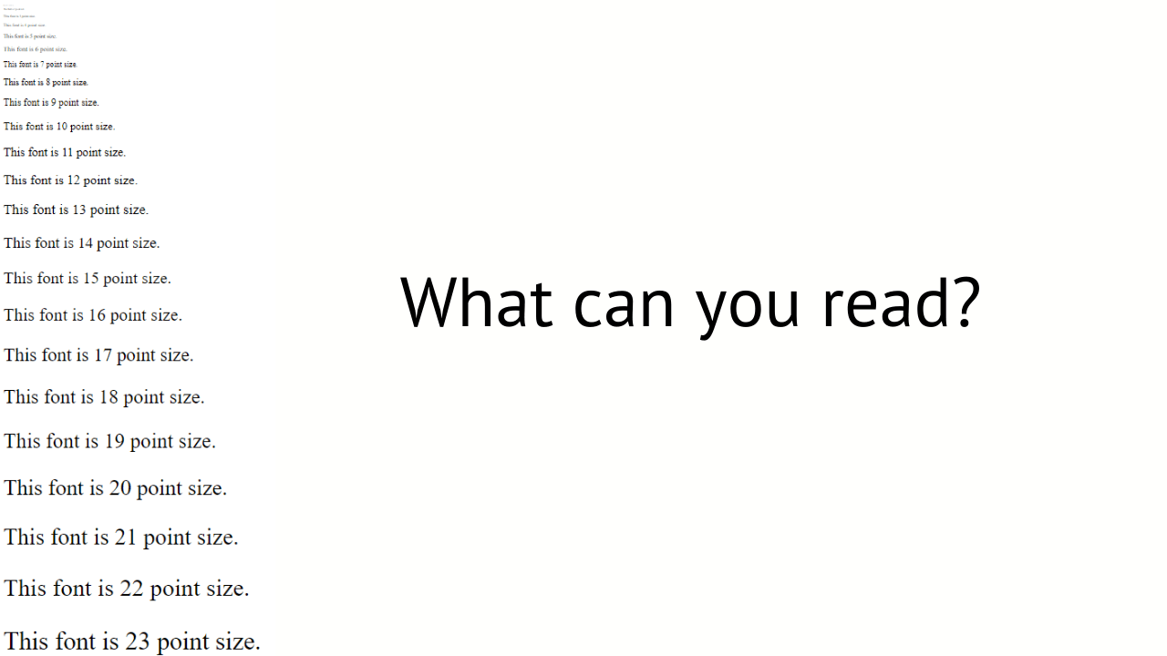
Point Size
Pay attention to the size of the fonts you add in and most importantly: think about the final screen they’ll be presented on.
A font size that may look fine on your laptop could be far too small for a larger venue. This means the audience in the back won’t be able to read your slide and may stop listening all together.
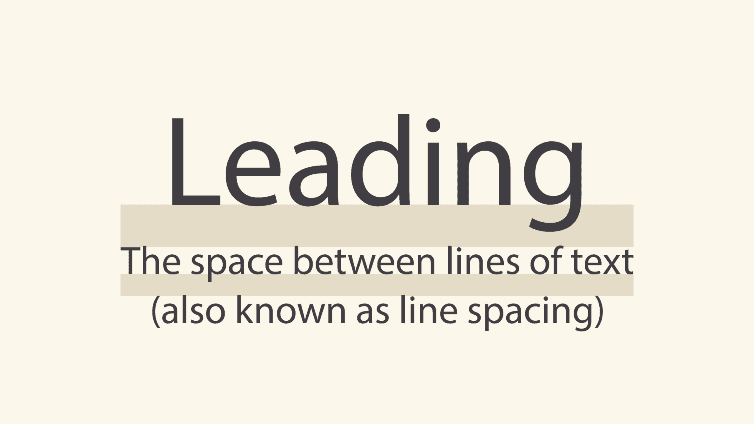
Leading
The space between your lines of text. Too little is hard to read, too much looks disorganized. Again, trust your instincts and move the text around until it feels right to you.
Pairing Fonts
Balance your slide design by using bolder fonts for headlines and smaller fonts for subheads. When choosing your fonts, make sure to pay attention to font families and choose those that are visually complementary.
WARNING
Keep in mind that if you are using unique fonts that you’ve saved to your PC, they will not be available on other people’s computers unless they download the fonts too.
This could be a huge problem if you try to use your presentation file on a different computer because it will replace your font with a generic one and all your formatting and design will be ruined.
Make sure that when you save your presentation to use elsewhere, you select the option to embed the fonts. This will keep you from having to scramble at the last minute in front of the audience you are trying to impress.
Depending on the venue and your tech capacity, another great option would be to upload and reformat the presentation on Google Slides. Your work is then available anywhere there is an internet connection.
Using Colors
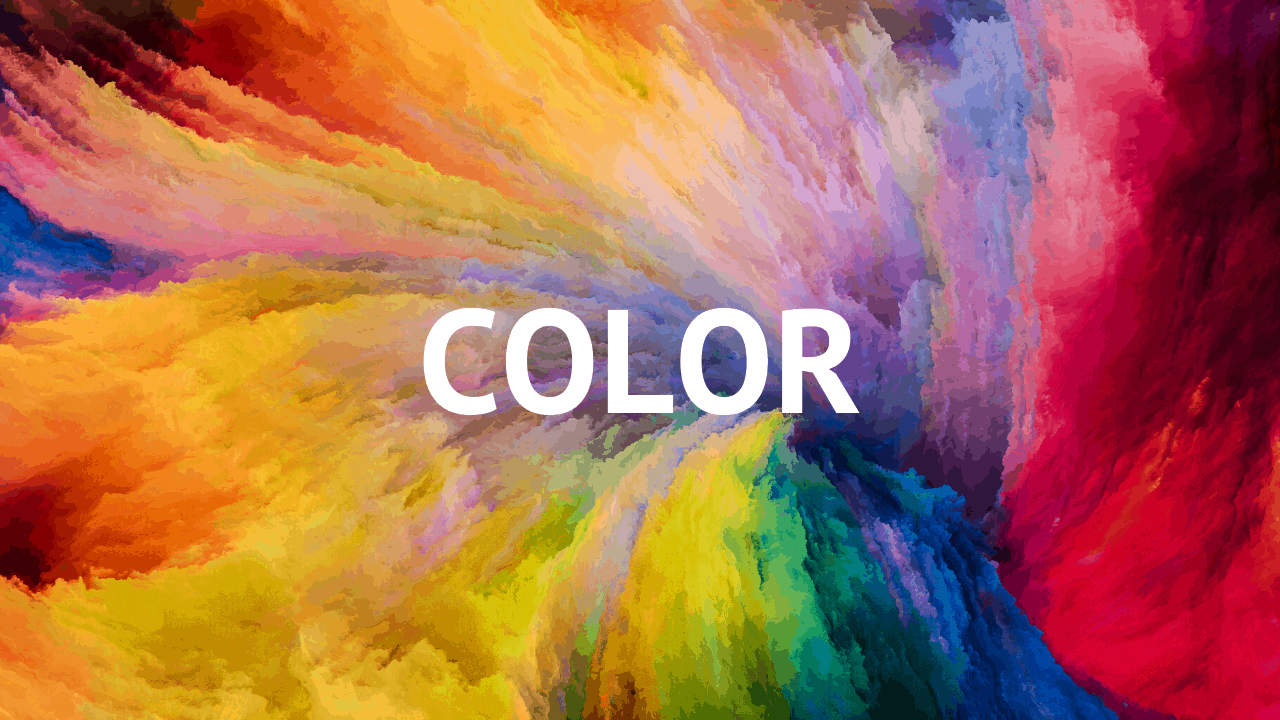
Color selection is a crucial element of your presentation design. Did you know that color is believed to be the MOST important visual experience to human beings?
The colors you use will play a significant role in the retention of the information you present. Here is what we know about the sentiment and emotion different colors evoke:
- Black: Mystery, elegance, death, evil, power, mourning.
- White: purity, cleanness, innocence.
- Red: shows passion, love, anger, and danger. It also means “stop”.
- Purple: sophistication, royalty, wealth, luxury.
- Cream: elegance, purity.
- Gray: conveys formality, conservative
- Blue: shows trust, peace, and confidence
- Yellow: portrays optimism and happiness
- Green: associated with nature and the environment.
Another factor to consider is the demographic makeup of your audience. Colors mean different things in different cultures.
- Red has multiple meanings across the globe, in China it means good luck, it signals danger in Europe and death in Turkey.
- Blue means immortality in Iran.
- Black is a sign of high quality and trust in China.
- Green means death in South America, high-tech in Japan, and good luck in the Middle East.
- White means mourning in Japan, and death in China and India.
Other considerations of color would be the venue and weather. If your audience is in a stoic cold room with gray colors in the middle of a winter storm, you may benefit from using warm colors for your presentation.
It may surprise you to know that colors actually elicit physical reactions in people. Red is known to raise your heartbeat and sense of urgency.
It is no surprise that online companies spend millions of dollars split-testing different colors of “buy” or “check out” buttons. Analytics show them there is a definite impact that colors have on how people interact with their website and offers.
This is how important color is to them. It is equally important to your presentation design.
Audio/Video
Some of your presentations may lend themselves to using video and audio clips. You generally want to keep these to a minimum. A long video can change the tempo of the room in ways you did not intend. Conversely, if used properly a short impactful video may be helpful to drive a point home.
Good use of video would be to establish credibility. A short clip of someone with high trust value and well known in your industry, and that clip endorses you, is a great use of video.
Audio falls in the same category. If it adds value, use it as needed. However, in either case, do not use video or audio for very long. You have probably been in a presentation where people started dozing off when a video or audio was playing.
Transitions and Animation
These visual effects generally tend to be overused and add little value to the presentation. A fancy transition wears out its charm after the 4th slide. If you need to use them, make sure they are brief and adequate for your presentation.
Text animations can sometimes add value and aesthetic appeal to your PowerPoint presentation. Keep them short and make sure they are not distracting.
For example, you may want to slowly reveal each word or section as you speak to it to give a sense of pace and novelty.
Data Visualization - Creating Eye-Catching Presentations
Using well-designed visuals not only make you look more professional, but using them to show your data also improves retention for your audience.
For example, it is much easier and more memorable to see this:
Than to see this:
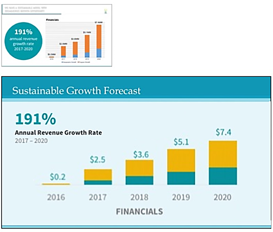
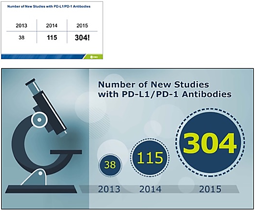
The idea here of course is that presenting information in an easy-to-remember and eye-catching format will help our brains process it much faster. It also improves retention since the human brain can process visuals in a fraction of a second!
So how then do we know how to put data visualization into effect? Here are five common visual aids to present data, and their appropriate use.
- Bar Charts - you’ll see these everywhere. They are ideal for showing comparisons and change over time. A practical example of this would be a chart comparing the sales of products over a certain amount of time.
- Pie Charts - These are a great way to illustrate parts-to-whole comparisons. A good example would be to compare the total number of followers to a social media account against the followers from each social network.
- Line Charts - These come in handy for illustrating progression or regression numbers over time. For example, the growth of market share in service areas over a number of years.
- Bubble Charts - These are well suited for simple data comparisons. For example, illustrating the percentage of people that take vacations based on multiple age brackets.
- Heat Maps - These graphics are great for illustrating the impact of events over a list of areas. For example, company insurance claims in different states. Red states have large claims, green states have fewer claims.
The key principles to follow are:
- Make sure to design your slides tastefully and strategically
- Do not overuse text
- Only include the main point on the slide
- Any additional information you can place in your presenter notes and include them in handouts for you audience afterward
If data and facts are a mainstay in your presentations, check out our article on data visualization for a deeper dive.
Well That’s It, You’ve Now Got The Knowledge Of A Professional Designer!
We have covered a TON of information in this guide. We did mention it is “The Ultimate Guide” right? We wanted to make sure it lives up to its promise. That’s how we do it here at Moxie Institute.
What you have here is a condensation of decades of experience from our award-winning coaches and trainers who have helped CEO’s of Fortune 500s, TEDx speakers, and top-performing professionals give exceptional presentations..
We also realize that for many of you, putting all of these concepts into practice while you are doing your high-demanding job may be impractical. We are here to help. We offer done-for-you presentation design services by our experienced in-house team of pros.
We also offer presentation design workshops as well as a public live online class if you’d like to develop and define the skills yourself.
However you’d like to engage with us at Moxie, we appreciate you and look forward to helping you become great at presentation design.