


PART 1 | PART 2 | PART 3 | PART 4
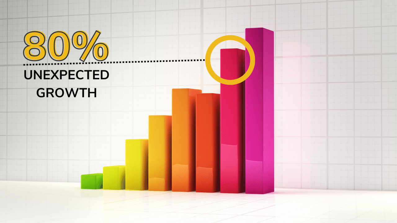
Did you know that the human brain can process a visual in as fast as 13 milliseconds? Our brains contain word processors, but they’re mostly made up of visual processors. We are quite literally wired to process visuals better than words.
So, when we read from flashcards or recite grand passages from memory, it’s fair to say that not everyone will retain that information to the best of their abilities.
Data visualization training allows presenters to convey confusing or numbers-heavy information in a clear and precise way. In Part 3, we covered great visual design, including style and structural principles.
However, those principles are only one piece of the pie. In this data visualization training, we’ll cover pairing visuals, numbers, and text: a presenter’s holy trinity.
Let’s get to creating memorable and impactful data visuals your audience is sure to love and, most importantly, remember!
Is Data Visualization Difficult?
No! All you need to know are basic style principles, like color theory, structural design, and the important principle of “less is more”. Add those two things to some basic training and you’ll have memorable visuals that will wow at every presentation.
How, What, & Why of Data Visualization Training
How many times have your eyes glazed over while “paying attention” to a presentation filled with crowded graphs and charts? Mine have, and I know I’m not alone.
There’s nothing worse than a presentation whose visuals are either:
- Way too complicated
- Not relevant to the topic at hand
But the good news is that turning data into interesting visuals is simple once you understand the core principles behind design that will make your audience’s eyes and brain happy.
Ultimately, it’s all about simplification and clarity.
Study after study has confirmed what we’ve known in our hearts for years: a picture is worth a thousand words. Or more specifically, visuals improve learning and retention.
This is key when it comes to effectively using numbers, graphs, charts, and statistics in any and all of your presentations.
Visual aids act as your props, so you can tell a clear and impactful story. They’re necessary, engaging, and will make you look like a top-tier presenter.
So, break out those confusing slides, graphs, and charts. It’s time to make them great.
Understanding & Visualizing Data in All Its Forms
Data visualization helps us form neural connections and retain information. Essentially, powerful visuals can evoke an emotional reaction in your audience, thereby improving their memory of your presentation.
Using those two key tools, visuals and emotions, you will be able to create an incredible presentation that’ll leave your audience hungry for more.
To start, it’s important to address how we create those powerful, emotional visuals. So, let’s break it down!
There are two ways to discuss your visuals:
- Data Types: What kind of data they contain
- Data Relationships: How they relate to any other data you may have
By understanding what information you need to convey, you can uncover the best way to present it. These classifications are necessary so you can evoke that powerful emotional reaction and leave a lasting impression on your audience.
There are four main classifications of data:
- Quantitative: Numeral values, can be counted or measured
- (e.g. age in years)
- Discreet: Numerical data with a finite number of possible values
- (e.g. number of pies in a bakery, mmm)
- Continuous: Data measured through ranges
- (e.g. annual car sales)
- Categorial: Data that can be sorted
- (e.g. breeds of puppies adopted)
First, figure out which categories your chosen data fits into. Then, think about how it all relates to each other. These relationships are defined as the following:
- Nominal Comparison: Simple comparison of quantitative values
- (e.g. number of visitors to various websites)
- Time Series: Measuring change in value over time
- (e.g. population change of a city over 20 years)
- Correlation: Measuring the relationship between two or more variables
- (e.g. lemonade sales skyrocketing as the temperature rises)
- Ranking: How two or more values relate to each other in relative magnitude
- (e.g. population density of Scotland)
- Deviation: Measuring relationships between data points and how far one data point differs from the mean
- (e.g. number of lemonades sold on a rainy day and then a sunny day)
- Distribution: How multiple data points relate to a single value
- (e.g. the heights of players on a college basketball team over the years)
- Part-to-Whole: Measuring a subset of data and then comparing it to the larger whole
- (e.g. number of goldfish sold compared to other animals in a pet shop)
Essentially, you’re playing matchmaker here. With each successful pairing, you’re one step closer to increased audience retention and engagement, as well as some memorable visuals.
Turning Data Into Relevant, Eye-Catching Visuals
Let’s get real here: just about everyone can throw together a PowerPoint presentation, slap some charts in there, and call it good.
Unfortunately, said presentation is a recipe for disaster, as well as a confused or yawning audience.
Those who take the time to hone their skills through presentation design classes, and courses (and, of course, reading articles like this one) are always better off.
Good data visualization ain’t easy, folks, especially when hosting remote meetings. But those who utilize data visualization and executive presentation skills like a boss are the ones audiences rally behind, time and time again.
We’ll cover the basic options you’re likely familiar with and then delve into how to elevate these common visuals to give them real impact.
Combining what we learned above with basic visual form, we can ascertain what works best in different circumstances.
For example, if I’m working with continuous data in a time series, I would use a line chart to showcase the general trend of my data points. So, I want to see how much lemonade I sold over the summers of 2015-2020. Using a line chart would provide a clear visual so I can easily compare the amount sold as well as the general trend.
Here are seven options for efficient and effective data visualization:
- Bar Charts: Best for showing change over time, as well as comparing categories and parts of a whole
- (e.g. showing the sales of ice cream each month)
- Pie Charts: Great for making part-to-whole comparisons with a small data set
- (e.g. comparing how many goldfish, dogs, and bunnies the pet shop sold in 2020)
- Line Charts: Work well for time-series relationships with continuous data
- (e.g. showing annual car sales from 2015 - 2020)
- Area Charts: Also depict time-series relationships, usually in color
- (e.g. different music genres popularity over the years)
- Scatter Plots: Great for large amounts of data, as they show the relationship between two sets of variables
- (e.g. comparing population growth in New York City and Boston over the years)
- Bubble Charts: Great for displaying nominal comparisons as well as ranking relationships in a visually engaging way
- (e.g. comparing data between world happiness scores and how many hours worked per country)
- Heat Maps: Best for showing categorical data while representing values through color
- (e.g. comparing probability and severity of workplace risks)
Remember, you’re matchmaking here! Be sure to use each visual in the proper context. When done right, they create compelling and evocative visuals that make your point easy to understand.
Adding data visualization to your skillset will help keep your audience engaged while presenting large amounts of information. What’s not to love?
That being said, there are a few things to watch out for when crafting your next presentation.
An Exercise in Conciseness & Clarity
You’ve compiled your data, created proper visuals, and sure, you understand it. But to your audience, it will most likely look like an overwhelming mess of numbers, statistics, and tiny notes in the margin.
And even if they do understand it, there is 100% a better way to show it.
Although it may feel wrong, oftentimes the best thing you can do is delete, delete, and finally, delete.
Remove all of the unnecessary components until only the most important points remain. If you’re unsure of what is necessary and what’s not, always refer to these four core principles:
- Meaning
You may need to dig deep for this one. Before you start to delete, you need to ask yourself why you chose this data in the first place.- What will your audience gain from seeing it?
- What information are you trying to convey?
- What do they need to know?
- Simplify
Get rid of irrelevant or unnecessary sections and data! There’s no need to be afraid of white space.Remember, you don’t want anyone to get dizzy and confused when looking at your graphs. And if you do, I have about a million questions I’d like to ask you. - Clarify
Next, take what’s remaining and distill it even further. Clarifying your visuals ensures your audience focuses on what truly matters. Cut the extra fluff! Be conservative with colors and make sure each visual is easy to read. Not all of us have 20/20 vision! - Focus
You want your audience to focus on you, not the screen. Take out as much text as possible so they listen rather than read. If you’re the presenter, your slides are the assistant. Don’t let them upstage you!
Step-By-Step Data Visualization Example
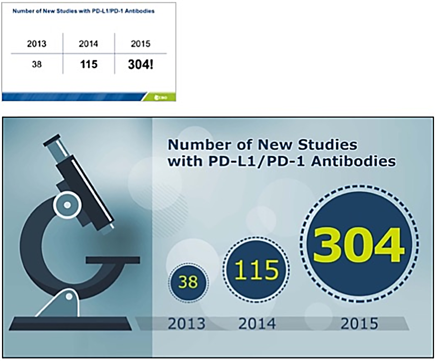
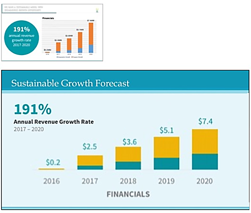
Take a look at the following graph. In our imaginary presentation, you only need to reference a few data points, so there’s no need for all this jargon and extra information.
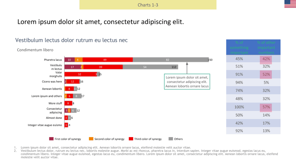
This may be your entire data graph, but it shouldn’t be what you show in the presentation. If your audience likes to see all the data, you can briefly show the full chart before moving to the simplified version for your point. You can tell them to refer to the presentation slides afterwards to review the chart in more detail if they wish.
Remember, the delete key is your friend!
Taken from a client of ours, this is how we improved their slide above.
(Note: for privacy reasons the words have been swapped with placeholder text)
First, remove all unnecessary headers and footers.

Then, remove the side table since the presenter isn’t referencing it.
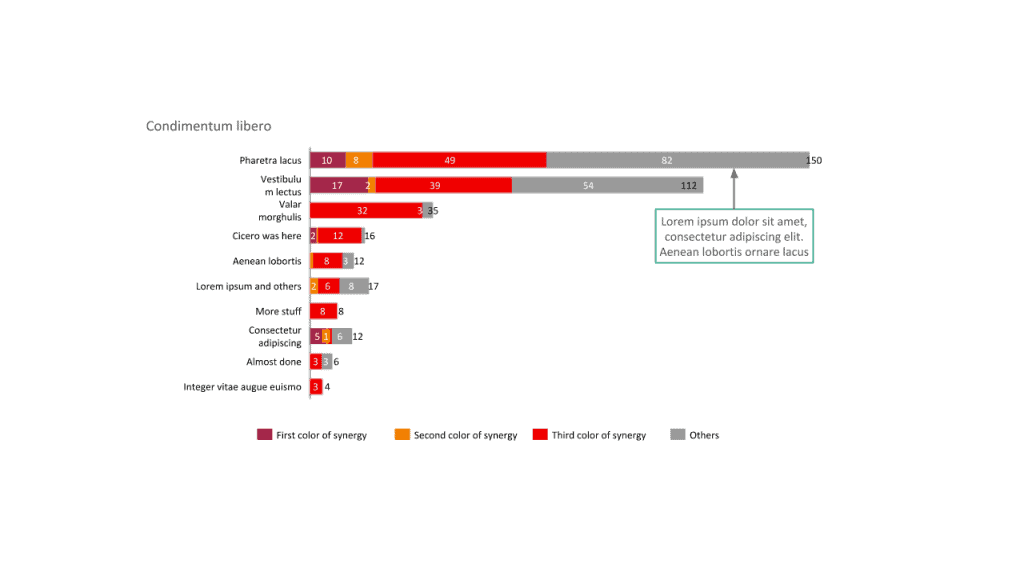
Finally, remove all irrelevant data and re-imagine the design to be easier to read and less distracting overall. Here’s the meaningful, simple, and clear final product:
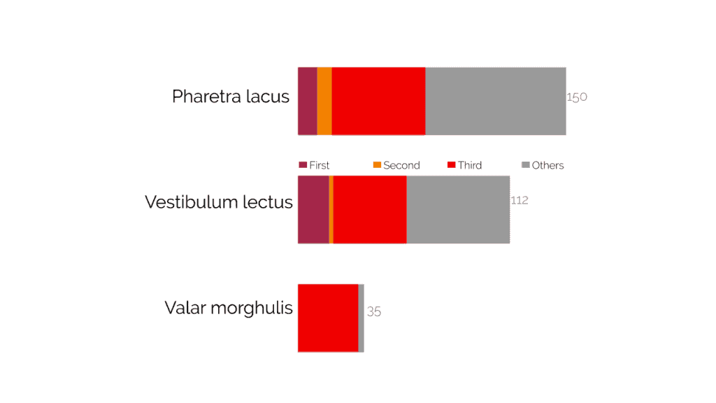
As you can see, cutting back and emphasizing what truly matters makes a world of difference. It’s night and day!
Now the audience knows exactly what data to pay attention to, can easily understand it, and will spend more time actually listening to the presenter.
The four principles above are key. But you should also want to improve your design skills and how your presentations look in general to really elevate your reputation.
If you haven’t read the previous blogs in this series, here’s a brief list of some of the tips and tricks to make awesome-looking visuals:
- Long blocks of text are a no-no
- Large images and color make visuals pop
- Bigger fonts stand out
- Make sure all text is horizontal and legible
- Visuals and colors make charts fun and clear

Previous
Next
Engage Your Audience
Take a look around the room.
Is your audience paying attention to you? Do they look bored or confused? Maybe excited and inspired?
Whatever the case may be, paying attention to those visual cues will inform any future changes you may need to make.
Don’t be afraid to run through your visuals ahead of time with a trusted colleague or close friend! Ask them questions and take note of their input.
Asking for honest feedback is a great way to ensure your slides work for an audience’s eye and not your own.
Remember, the real key here is to become a lifelong learner. If you keep learning and asking questions, you’ll keep improving!
Great Data Visualization Training Should Be Fun And Lead By Example
If you want to impress at your next corporate event, client meeting, or monthly data visualization soirée (that’s a thing right?), you can always get professional data visualization training and other services to accelerate your improvement and reputation.
Moxie Institute can help you with data visualization training in a:
Or Our Experts Can Design The Slides For You
Without a doubt, data visualization training will elevate your presentations and audience engagement like no other.
So, what’s stopping you? It’s time to get visualizing!