


Tax season is here and tax day is upon us. Taxes are basically mind numbing, immense amounts of data that must be interpreted correctly in order to reap the benefits. Misinterpretation or simply ignoring the data leads to fines, penalties, and all sorts of painful punishment.
Why are we talking about taxes? Taxes, like the data in your presentations, have many parallels. We have no tax tips to give you in this blog. However, we do have the answer to presenting data in a way that will help you reap all the benefits of a hefty tax return!
Most of us have probably been given the challenge of presenting data in our talks. Some of us are asked to include data in every talk. When faced with this challenge, ask yourself if there is a more effective way to present numbers through visuals. This is often called business storytelling or data visualization.
We process visuals approximately 6.000 times faster than numbers or text. A simple graph, chart, or visual representation of your data will help your audience absorb it faster and process it more effectively. Too good to be true? This simple, yet still renegade, technique will make even the harshest audience stop auditing and start listening.
William Glasser said: We learn 10% of what we read, 20% of what we hear, 30% of what we see, 50% of what we see and hear, 70% of what we discuss, 80% of what we experience, 95% of what we teach others.
So, how do we ensure that our audiences retain 80% of the data we present? By combining the data with an emotional experience. And, how do we provide an emotional experience? Through high-impact visuals, storytelling, or descriptive language that makes the audience feel as well as think.
Visual aids that amplify the meaning of our words give our presentations the ethos (emotion) and pathos (logic) it needs for information retention. The pathos is derived from our words and the ethos is derived from our visuals.
Presentations that deliver hard data, information, and statistical analysis can still be engaging and impactful. The goal is for your audience to understand the main point and absorb it so that they can make decisions with the information that is being presented.
Below are our three top tips to use data effectively:
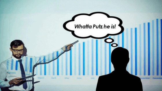
BULLETS KILL PRESENTATIONS.
The outdated concept that a good presentation should be riddled with bullet points is absolutely killing our presentations and boring our audiences to death. In Seth Godin’s Really Bad PowerPoint, he gives the following example.
If you’re giving a talk on the pollution levels in Houston, you could show me some bullet points with statistics provided by the EPA on pollution levels or you could show me an image of a bird killed by the pollution and then give me the numbers. Look at your presentation and try to eliminate any unnecessary bullets.
Instead, replace them with images that show instead of tell. We admire your onslaught of PowerPoint deductions…and plan on writing you regularly when you go to jail for death by bullet points.
A PICTURE IS WORTH A THOUSAND WORDS.
Ditch the text and visualize the story. Think of each slide as a sticky note and try one thought per slide (thank you, Nancy Duarte, for this awesome visual).
Visuals provided in this way are useful to your audience because we can’t read the text and listen to a speaker at the same time but we can listen and look at relevant imagery. Give your audience what they came for…YOU. And provide them with the data in a way that makes it easy for them to focus on the important parts of your talk.
KEEP IT SIMPLE.
We’re going to keep it simple, too. Here’s an old adage that still rings true. If you can’t explain it to your grandmother or the 7-year-old next door, it’s too complicated. Keep it simple and clear. Avoid cluttered slides and fancy jargon if you’re speaking to an audience that isn’t direct peers or colleagues. Fancy jargon doesn’t make you look smart. Or fancy. Breaking it down for an audience so that they can process the fancy jargon is crucial. This is EXACTLY what your CPA does, right?